A Little Holiday Journaling


Last week I was on holiday in the lovely Yorkshire Dales with my parents (and the dog!) in a cottage and I took with me a fair amount of crafty supplies including art journaling and bible journaling supplies.

And before you ask, no I didn't lock myself in a cottage and just craft! We went walking a fair bit, took some time out at a nearby lake. As most of the days I had time either first thing in the morning or while tea was cooking to do some art journaling.

I took my distress oxide inks to have a play and experiment with plus some stamps that I knew could give a look of texture.

The weather was so amazing and such a blessing I decided to try out a bright distress oxide-based page to see how it turned out. Overall, I'm not that happy with it, but I enjoyed the process and learned a few things along the way.


My art journal is really a scrapbook that I bought at an artisan market in Sydney, Australia a few years ago and I never scrapped in it! Because of that, it has thick black pages with a thick tissue paper-y insert between each page.

I used a mini ink blending tool to spread some Cracked Pistachio on the bottom for the grass (obviously) and some Broken China on the top (sorry lost that photo!)

distress oxide ink art journaling


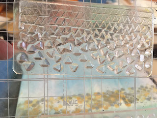
There are lots of dry-stone walls in the fields around where the cottage was and as it happened, I had this honeycomb stamp (it was a freebie a couple of years ago from a DoCrafts magazine) that I knew would at least give the impression of the walls. I layered Iced Spruce Distress Oxide, a gold inkpad plus a brown-y IZink ink pad I got as a freebie with a magazine. I don't really have any other greys so I thought triple layering the Iced Spruce over the gold and brown might make it look near to the walls I saw everywhere!


I used yet another freebie stamp (from the same mag) to give a hint of the wild flowers we saw on our walks. This time in Cracked Pistachio, Candied Apple and Worn Lipstick distress ink. I only applied ink to random areas of the stamp.

texture stamp art journaling

I then decided to use a fern stamp (another freebie from one of the many papercraft magazines, I've had it about 12 months and can't remember where it's from!) I was going to only use Cracked Pistachio and then stamp, but decided that it might look good with pink tufts too, so I inked it up with Worn Lipstick and stamped! I actually ended up creating this page across the main black page and the white tissue-y insert I felt the pink was lost a bit in the darker page so stamped on the lighter side!

stamping distress inks
I also needed to do hills. Loads of hills around (that is why its called the dales after all) and found a couple of stamps I'd brought with me with hills on - believe it or not, these are from a Christmas set, I think from Crafts Beautiful mag last year, but they were perfect for what I wanted! I used a baby wipe to remove where I didn't want the ink to go and stamped above the wall-line


Then I used the green colour to add more ferns!

Never think your seasonal stamps should stay there!

I then sketched in a little tree using my Inktense Pencils as well as the  title Summer In The Countryside. 


Sadly, I think it looks very flat and almost a contrast page (night and day) which it certainly isn't. I've realised that if I want colour to come through with the inks I will probably need to prep the page first. I'm going to keep it in, for a lessons learned/experiment page.


Comments

Popular posts from this blog

Creating Designs and inspiration

Sorry for my delay in this post, I'd had a plan for it but then Life got in the way and I found myself distracted and a month has gone by. So here it is. It's not so much as a "how to" but more my experience of trying to make creative designs on paper for my jewellery when I left Art as a subject behind when I completed my GSCE's and took a more science-based path (that's for another time though). When I started bead weaving and bead embroidery, I used printed patterns by other people, and I still do, but there is nothing like making something from your own design. But where to start... For me, I usually look at what beads I have and simply make it up as I go along as inspiration takes me, but that can give varying results and not always good! Beads!! Shapes, Sizes, Colour! A vague pattern in my head did not come out anything like how it should! I write poetry every now and then and I've got into the habit of keeping a notebook in almos

Craft Fairs, Craft fairs and makers fairs

I originally set out to write this post about my experience of booking onto craft fairs when on a small, tight budget. However, at the time of writing this post, I have completed two craft fairs, both very different and with differing results, so the scope of this post has widened and hopefully you can pick up a few tips for future reference. September is turning out to be a particularly busy month for me. Somehow I managed to book myself onto three craft fairs across three weekends on the run. I’ve managed to get myself confused, unconfused and confused again.  Two fairs I’ve had my eye on for ages and couldn’t get on an earlier fair either because it was fully booked or I was simply booked for something else. Signing up to email lists has been both a great help and a bit annoying. It has helped me stay ahead of the curve and book onto fairs early but for the weekends I am already booked up or simply skint I’m annoyed I can’t book on. So what happens when that does happen?

Experimenting with splatters and distress oxide inks

I love stamping and by extension, ink pads. I particularly love the Distress Inks and Distress Oxide Inks by Tim Holtz and decided a couple of weeks ago to create a bit of an art journal page using two of my Oxide Ink colours, a chipboard word and some splattering. I'd cut down a piece of A3 multi-media paper into 4 (essentially four A5-ish sized) pieces and my plan was to make splatters and reveal a word un-splattered on the paper, but it didn't quite happen like that. First things first. I smushed some ink onto a piece of plastic packaging. I diluted the ink with water and used a cheap-y brush I've had for ages that flicks watercolour etc quite nicely onto a page. I used Iced Spruce and Cracked Pistachio Distress Oxide Inks SPLATTERS!!! First layer second layer I continued to build up layers of splatters until I was satisfied with the result. Then I removed the chipboard word. This is not an ink blot test - or is it? W